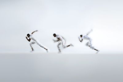

Over the past 15 years, Hyperice has built its reputation around a clear ambition: creating elite recovery technology that helps people move and perform better—whether they are professional athletes or simply recovering from the demands of everyday life. The Hypervolt 3 line continues that mission. Introducing a new generation of percussion therapy devices, the Hypervolt 3 family offers three distinct models designed to relieve tension, loosen tight muscles, improve mobility, support warm-ups, and accelerate recovery after activity.
For the launch of Hypervolt 3, we developed a dedicated product identity that captures the essence of the device itself. At its core lies percussion which is the rhythmic motion that defines both the product’s function and the visual language surrounding it. Drawing inspiration from this movement, we created an imagery system that echoes the product’s pulse and energy. Dynamic compositions interact with the product in motion, translating its mechanical rhythm into a visual narrative. Central to the identity is a distinct line system, derived directly from the device. These lines introduce a sense of direction, tempo, and force—creating a flexible graphic framework.
A vibrant green serves as the signature accent within an otherwise restrained monochrome palette. It introduces a constant sense of energy and momentum, echoing the dynamic nature of the product. Used sparingly yet consistently, the color cuts through the neutral backdrop—bringing focus, vitality, and a recognizable pulse to the Hypervolt 3 identity.
Someform Studio further contributed to the project’s visual execution through 3D design and motion, supporting the storytelling and ensuring a consistent, high-quality aesthetic.
Together, these elements form a cohesive identity that can scale across product launches, marketing materials, and digital experiences—establishing a clear and recognizable expression for the Hypervolt 3 generation. A new era of percussion.
More projects